Thursday, January 19, 2012

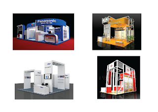
Compilation of 3D exhibition booth project. End of project :D

This is a compilation of Phase 2 of the project. This also marks the conclusion of this current project and has served a lesson for future projects that will come our way. 

top and front views 


side and 3/4

artist impression

Grahics used in the making of the 3D model

Wednesday, January 18, 2012

Form is Function, Function is More


Form follows function is a principle associated with modern architecture and industrial design in the 20th century. The principle is that the shape of a building or object should be primarily based upon its intended function or purpose.

(sourced: Wikipedia)
Though connected with the sculptor Horatio Greenough, the term actually was created by Louis Sullivan, an American architect. He first wrote in in his article in 1896. It was the time when old buildings were still abundant and he thought that it was near time that it was all replaced by newer and more innovative forms of buildings. He also thought that the form of the subject should come from its function, and not from its historical origins.

The terms just basically suggests than simple design tops the more complex and complicated ones. The beauty of the design comes from the function of it, not from the aesthetic value. But even though this might be true up to a certain point, while a functionally objective design process might create a timeless and completely practical design, it can instead come of ad boring and uninteresting.

Side and 3/4

This is the side view of the 3D modelling as well as the 3/4 view otherwise known as the 'perspective' view.

We were a bit puzzled on why did it turn darker once the rendered picture was transferred to Photoshop but we managed to adjust it to enhance the look.

Tuesday, January 17, 2012

Top and Front

This is the top and front view of the 3d modelling of our exhibition booth. Excuse the typo. What says facade is really meant to be the top view. I guess lack of sleep really impairs you ability of straight thinking while typing.

In progress...

Monday, January 16, 2012

Artist Impression

Our attempt at an artist impression. We took a picture of the inside of a shopping complex, this case being Alamanda Shopping Centre, and superimposed our 3D model exhibition booth onto the picture to create a believable image and realistic situation.

The process of superimposing the image in Photoshop...

Sunday, January 15, 2012

Le Modulor

Le Modulor, an anthropometric scale of proportions devised by the Swiss French architect Le Corbusier (1887–1965).

It was developed as a visual bridge between two incompatible scales, the Imperial System and the Metric system. It is based on the height of an English man with his arm raised.

It was created by Le Corbusier in an attempt to use the knowledge of the mathematical proportions in the human body in order to improve the aesthetic value of architecture as well as its function. The system is based on human measurements, the double unit, the Fibonacci numbers and the golden ratio. Anyone would recognize Leonardo da Vinci's Vitruvian Man, and Le Corbusier simply uses the results from works such as these to improve his architecture.

It was used as a system to set out a number of Le Corbusier's buildings and was later codified into two books.

(source: Wikipedia) 

Saturday, January 14, 2012

Less Is More, More Is Less


 Some people have their own certain understanding of design. Some like the robust, flowery kinds of design while some cherish the simplicity in theirs. The wide range of design preference is as varied as the people that occupy this world.

Simple design, or 'minimalist' as some call it, is a design that is mainly preferred in the design world, especially architectural ones. Architect Ludwig Mies van der Rohe even adopted the saying 'Less Is More' as his motto.

 The thing is, some people assume that the term 'Less Is More' means a reason to be lazy and think that you don't need much effort to create something good since it requires less materials or less subjects. But it is the exact opposite. More thought is needed to think about where exactly should an object be placed on the design for it to be just right. Since you work with less substance, the upmost care has to be taken for the design to look not too empty but is balanced to a point. Simplicity is not an excuse to be lazy, in fact it requires the exact opposite!

Wednesday, January 11, 2012

Artist Impression?

Not quite sure on what an artist impression is exactly like. Is it supposed to be inside or outside? With people or without people?

Decided to search on Google and see what I found. Quite a variety of images come out and still not sure how is it supposed to be. Shall check on other groups on their progress to have this question answered.

Saturday, January 7, 2012

Graphics part 2

Decided that we would use some existing ads from the product to incorporate into the model of the exhibition booth. This would in turn make it more realistic and more recognisable.

Pictures of the products are also put into the design so that the customer would be able to recognise it more easily especially if it is modeled as a bigger than life size model. This would make it stand out so people could see it even from far.

Tuesday, January 3, 2012

More research

Just some follow up on the research of 3D renderings of exhibition models. It should be more helpful to have some more references. The more the merrier!